…AKA Arial and other clones. MOMA is holding a commemorative exhibition to celebrate what has become the most widely used typeface in the world.
As a graphic designer and occasional typographer, I have preferred to avoid Helvetica. Not because it is a bad typeface. To the contrary, it is one of the cleanest, most readable ever designed. But its ubiqity and, to a degree, sterilility, compel the use of other typefaces.
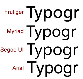
Some more info related to the comments posted:
It’s interesting that they mentioned in both the WaPo article and Helvetica film synopsis how much it has been used for signage. I immediately thought of Frutiger, which was commissioned expressly for signage – first for France’s Charles de Gaulle Airport – but now it’s what’s used in Switzerland. Frutiger is also a Swiss designer. I think it’s a more aesthetically pleasing typeface, particularly in heavier weights.
Like Helvetica clones, such as Arial, Frutiger has been closely copied by Adobe’s Myriad and Microsoft’s Segoe:
not sure my tech. writing students would sit through a feature length documentary on it, but I’d be curious to see it:
“Helvetica” directed by Gary Hustwit
http://www.helveticafilm.com/
Glad to know that documentary is out! Gary hands out pins that read: “I hate Helvetica” or “I love Helvetica,” depending on your preference.
Leave a comment: