Demography Trumps Everything
The NY Times map of “Where the Candidates Found Support” provides one of the more interesting views of the Democratic primary race. Note how Clinton won a swath of the country (from north Texas to upstate New York that you could term Trans-Appalachia. Obama, meanwhile, took the everything on the other side of them thar hills, which happened to be both more heavily populated and more African-American. But I think it’s interesting too how he picked up all of the predominantly white Northwest too.
“Demography trumps everything” sez David Runciman in the latest London Review of Books, “The Cattle-Prod Election:”
“But viewed in retrospect, it is clear that it has been quite predictable. All the twists and turns have been a function of the somewhat random sequencing of different state primaries, which taken individually have invariably conformed to type, with Obama winning where he was always likely to win (caucus states, among college-educated and black voters, in the cities), and Clinton winning where she was likely to win (big states with secret ballots, among less well-educated whites and Hispanics, in rural areas). Even the initial drama of that week in early January – when Obama’s victory in Iowa had seemed to give him a chance of finishing Clinton off, only to be confounded by her victory in New Hampshire, which defied the expectation of the pundits and had them all speculating about what had swung it (was it her welling up in a diner? was it hastily rekindled memories of Bill? was it hints of hubris from Obama?) – turns out to have been an illusion. Iowa was Obama country (younger, smaller, caucus meetings) and New Hampshire wasn’t (older, bigger, voting machines). The salient fact about this campaign is that demography trumps everything: people have been voting in fixed patterns set by age, race, gender, income and educational level, and the winner in the different contests has been determined by the way these different groups are divided up within and between state boundaries. Anyone who knows how to read the census data (and that includes some of the smart, tech-savvy types around Obama) has had a good idea of how this was going to play from the outset. All the rest is noise.”

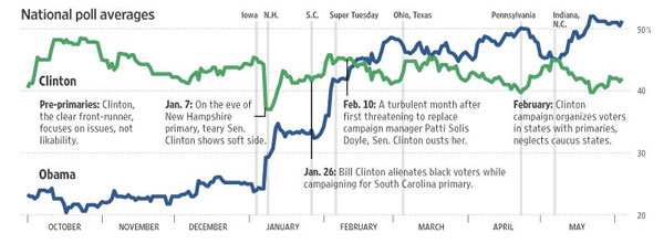
This Slate graph (via WSJ) of National Poll Averages shows how Clinton’s support never really varied but Obama’s continually rose. (Also see RealClearPolitics McCain vs Obama trendlines.)